Mounties adjust to a new PowerSchool
After weeks of navigating a new format, Mounties are finding the positives in the sudden change.
March 17, 2023
“Powerschool decided to discontinue the use of their app over the summer last year — the summer of 2022…So it was a little tricky in the beginning to make the switch over in both cases, but so far it seems to be going okay,” said Mrs. Meridith Herne, Mount’s Instructional Technology Coordinator.
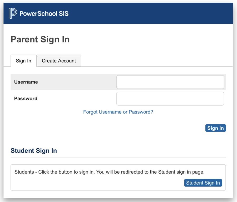
When students returned to school in January, they were met with an email about the Powerschool switch. The email included a Mount-specialized link to the Powerschool website.
When the switch first happened, chaos erupted in the hallways.
What happened to the app?
What is my new email?
Why are my classes not color-coded anymore?
Mounties were stunned by how different the website was from the classic Powerschool app. Searching for the special link, typing in the fresh account information, and navigating the unfamiliar terrain was a laborious series of tasks, especially in the beginning. However, about two months later, the prominent flaws of the website seem to be a lot less devastating.
Mainly, students have begun to look at the difficult sign-in process as a benefit of the website.
“The website – it takes a lot more work to get in, so I don’t check it as often, which is a lot better for my mental health since I’m not so anxious about my grades all the time and I’m not compulsively checking,” said Gianna Scotto ‘24.
“Switching to the PowerSchool online is better because I feel like I don’t have to check it as much. I feel a little bit freer going to school everyday, and I’m focused more on the material of the work instead of the grade I’m receiving,” said Kari Prosperi ‘24.
“I’m not checking it as much, so I feel like it’s better for my mental capacity… I don’t like the setup of the app, and I do like my mental health now,” said Amy Perkins ‘24.
Additionally, the format of the website is completely different from that of the app. On the app, the letter grades were displayed largely in different colors whereas the website simply lists all of your grades in a small, black font.
“… I feel like it’s easier for me to write down and get my assignments in line, and know when I have to do things, and everything like that… Your grades aren’t as huge on the screen and it’s also not as easy for other people to glance at your iPad and see your grades. They really have to be looking at it to know,” said Julia Solecki ‘23.
“There’s now the numbers, and it’s tiny, and it doesn’t stress me out as much. The ‘fun, little, colorful F’ – sure it was aesthetic, but it didn’t feel good to look at, but I feel like the website all blends together,” said Scotto.
“I will say the web browser has more functionality than the app ever did, so for that reason, it’s gonna be better for viewing your grades and assignments, it’s gonna be less buggy,” said Mrs. Herne.
Altogether, switching from the Powerschool app was a huge change. Although the cons took weeks of adjusting, the majority of Mount students have found a way to welcome this change into their lives.











adviser • Mar 23, 2023 at 3:47 pm
Helpful to hear the student perspective on these subtle changes—I had no idea how strongly the students felt until I read your story.